The College of Physicians and Surgeons of Ontario
The College of Physicians and Surgeons of Ontario

Client
The College of Physicians and Surgeons of Ontario
Duration
5 months
Role
UX Design Lead
Contributions
Design Research & Strategy, Information Architecture & User Flows, Visual Design, Interface Design, Interaction Design, Prototyping & Testing, Documentation & Handoff, Quality Assurance
Overview
I help organizations make their websites more useful and engaging, without unnecessary complexity. For the College of Physicians and Surgeons of Ontario, I refreshed their homepage to highlight growing content offerings while working within their existing design system. My approach focused on practical improvements that could evolve with their needs, creating components that showcase news and podcast content in a way their team can easily update.
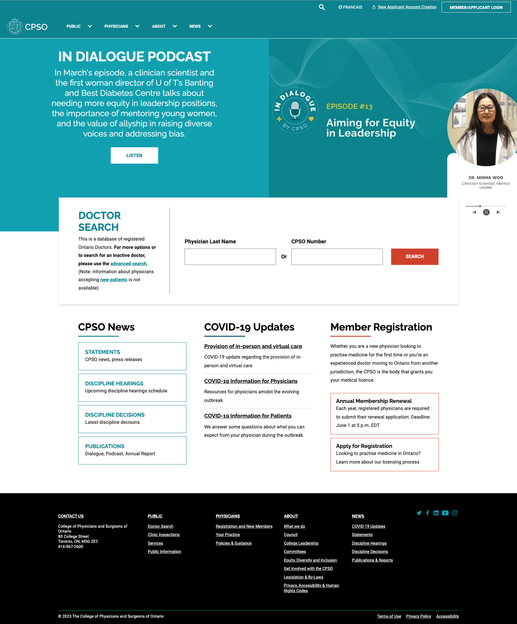

Website Archives. Initial state of the homepage desktop and mobile before redesign.
Discovery
I dug into how their current site was working by exploring their website structure, checking out similar organizations, and having real conversations with their team. This helped me understand not just what they wanted to change, but why it mattered to them and their users. I discovered they needed better visibility for their media content without disrupting the familiar experience their users rely on. The existing structure had potential - it just needed thoughtful adjustments rather than a complete overhaul.


I took notes while checking out their website design. I looked at how their pages were structured and what design elements they already had. This helped me understand their existing system before suggesting changes, ensuring my new designs would work well with their established patterns while identifying clear opportunities for improvement.
Strategy
Rather than suggesting a full redesign, I focused on creating flexible components that could live within their current system. This practical approach meant we could make meaningful improvements quickly while respecting their budget and timeline. I explored multiple configurations for these components, showing how they could adapt to different content needs now and in the future. This strategy meant giving their team tools they could use independently, without constantly needing developer help.


Through collaborative discussion, we identified the hierarchy of components - from primary to tertiary importance. This crucial analysis laid the foundation for our visual design priorities.
Design
I created wireframes showing different ways to arrange content on the homepage, making it easy for the team to visualize options. Building on what worked in their existing design system, I developed components with clear visual hierarchies that guide visitors to important content. Phase 1 established the foundation for the homepage, while Phase 2 extended these improvements to landing pages. Throughout the process, I made sure everything would work smoothly on both mobile and desktop devices.


-
"I've had the pleasure of working with Brittany in her role as UX Design Lead at BlueModus. She supported my team in developing UX strategies and design that created incredible value - and happy clients. Brittany's approach is thoughtful and innovative. She has an amazing ability to think critically about what the client needs, and find creative ways to fill those needs through design. She has an authoritative but relaxed demeanor with clients that really puts them at ease. She is patient and collaborative with her colleagues across teams, which creates an environment for real creative partnership. I would be grateful for the opportunity to work with her again. If you have the chance to work with Brittany - take it!"
– Amber Rajcevich, Strategic Director at BlueModus